In 2021 and 2022. I collaborated with Icarus Theatre Collective on a research and development project to explore how to integrate creative captions into their production of The Lesson by Eugène Ionesco.
This project was a real opportunity to explore different systems, different styles of captions and use feedback from a deaf and hard of hearing audience to help us create captions that worked for them. We already had a set built that was based on previous discussions and ideas but it wasn’t tested until we were all in the theatre venue with a projector.
During the first week I used two different platforms, QLab and Notch. I was keen to experiment with Notch to test a real-time captioning system and integrate some interactive parts to the show using a Kinect Azure. Early on, we realised that this would be rather challenging with the number of unique animations and styles we wanted to implement into the show. With more time I believe we could have continued with using Notch. However, for a more simplified setup and opportunity to really focus on the caption design we decided to use QLab.
The first exercise was to figure out where we wanted to display our captions and determine a font size that would be suitable for the space. This would help me with breaking down the script and set cue points for the captions.
We also decided to have two types of captions. A and B.
A is for captions where we wanted to put more emphasis on animation and style, these would be video cues, possibly incorporating images or motion graphics.
B is for simplified captions during dialogue heavy scenes, these captions would have a consistent style and animation throughout.
It felt necessary to take this approach as the script contained a lot of dialogue without many pauses. Having all the captions completely styled and animated would take a very long time without a team of designers, therefore we highlighted which parts of the script we wanted to be more animated.
We trialled projecting the script as it was formatted onto a screen, displaying each line by line. At this point it was clear that we would have to break the lines down and have the captions appear for longer than the actors were speaking. Our solution to this was to have captions appear from top to bottom and once the captions reached the bottom they would start again from the top.
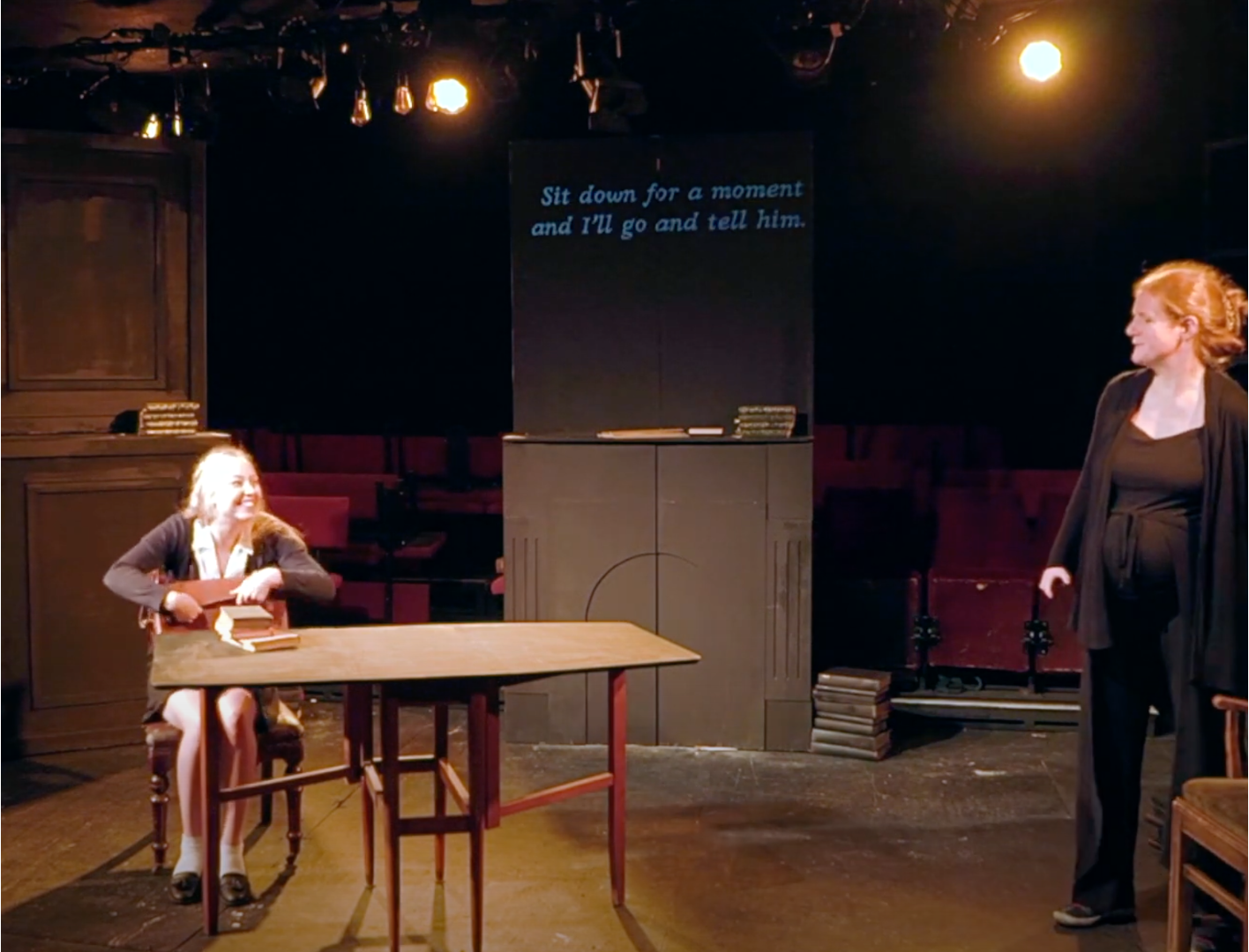
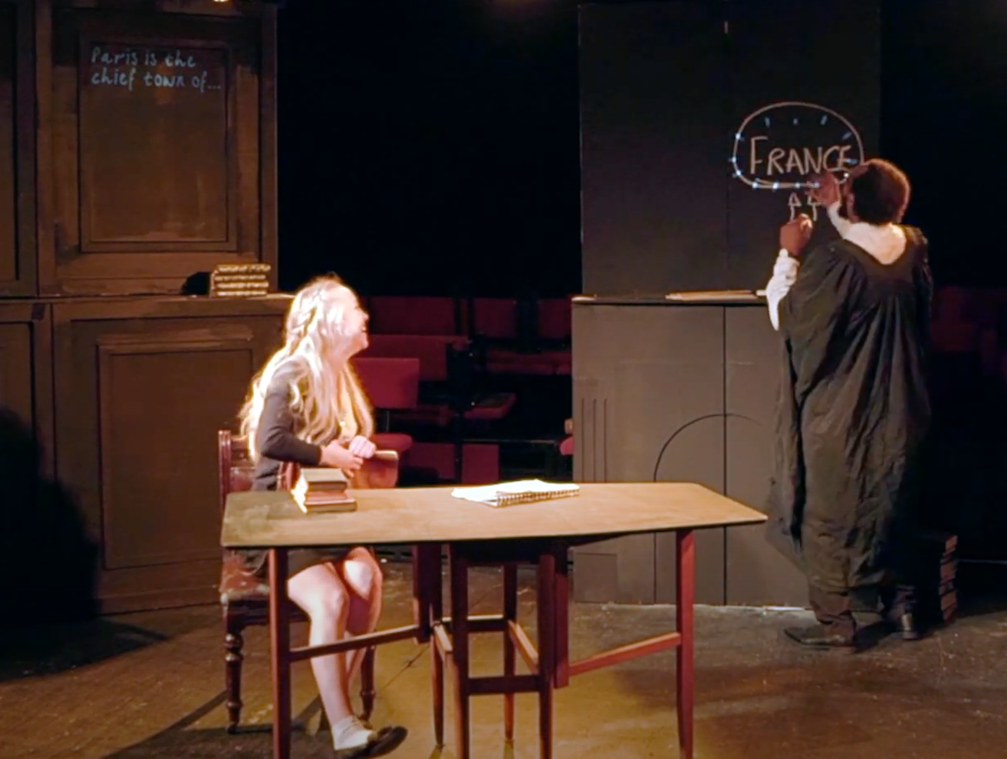
We also wanted to test different fonts for different characters and different placement of captions for each character. We used the framing of the set to map out areas the captions could appear on, creating different surfaces for different characters.
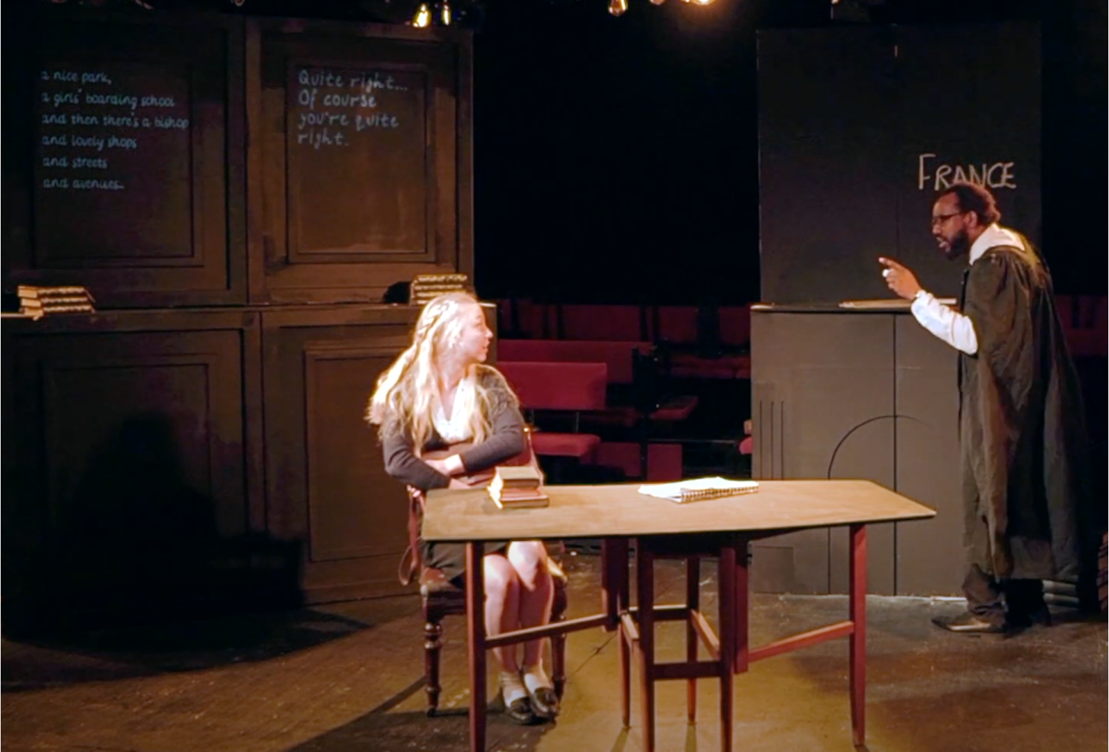
One unique element to our play is that the set eventually becomes covered in chalk, handwritten by one of the actors. This presented an opportunity for the actor to interact with the captions, linking his own handwritten parts with the captioned parts. For example, we tested taking out some words and letting the handwriting continue to the end of a sentence or emphasising the handwritten chalk with animation.
While every production that you work on will be different. There are things we can all learn from our own creative captioning projects.
I have learned that you must make sure that the director understands your needs and expectations and vice versa. It is best to settle on a design choice early on and stick to it without changing. Designing and programming captions can be a long and cumbersome process and the last thing you want is to have to redesign everything last minute.